SOW
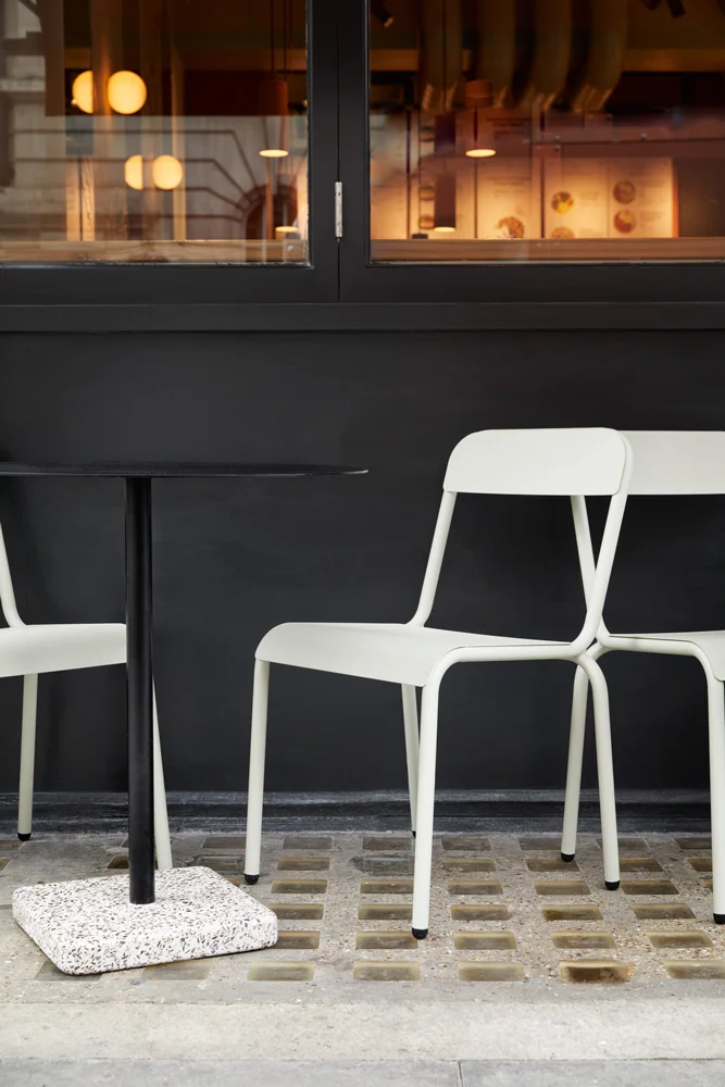
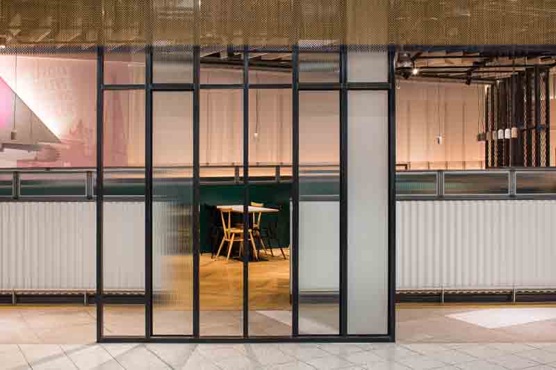
We designed and delivered SOW, a new health focused fast-food restaurant in Soho, London.
Having been involved from the very beginning, we helped establish the visual identity of the brand, which emerged naturally from the development of the architectural concept. By bridging both disciplines we were able to craft a truly holistic vision that carefully balances architecture and graphic design.
The name of the venture, brought in by the client at inception, derives from the act of sowing seeds, underpinning the brand’s philosophy towards environmental consciousness and wellbeing.
To align with the brand’s mission statement, our design ambition was centred on honesty and tactility. Our aim was to make every surface the customer touches rich and haptic, to reinforce the focus on the provenance of the restaurant’s offer.
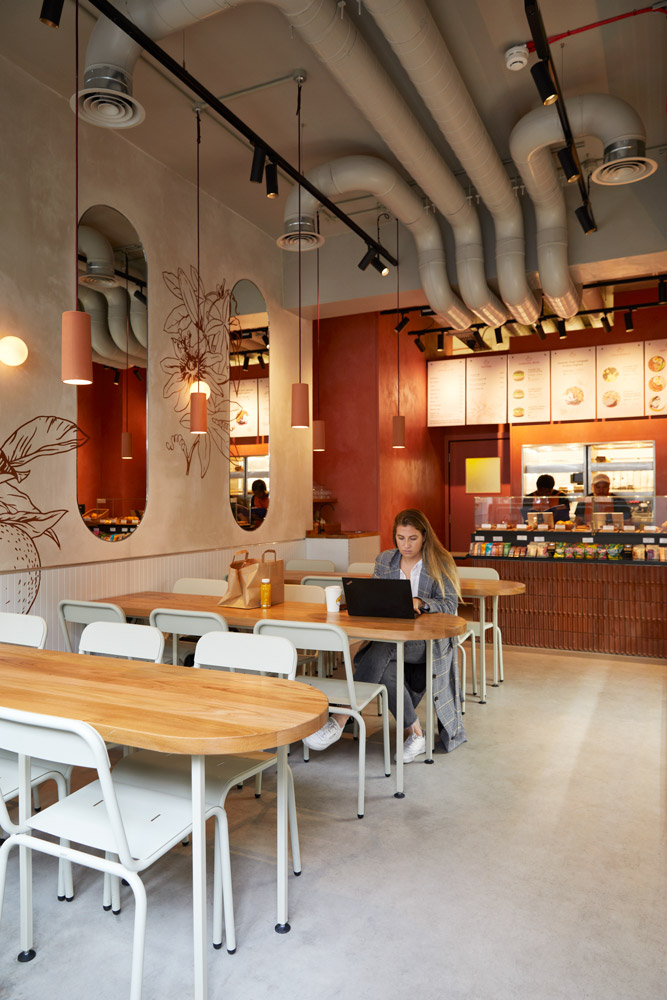
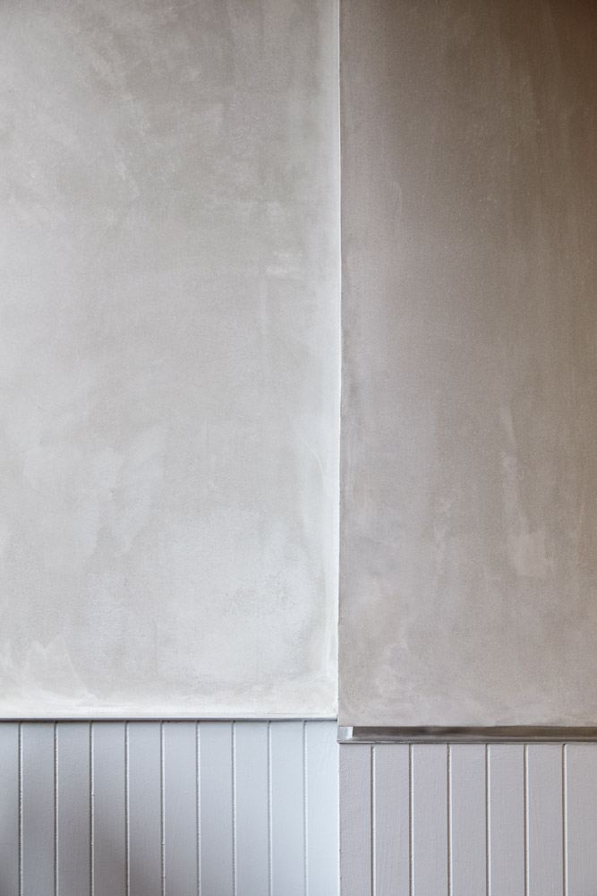
Raw plaster walls lead the visitor into the space, where hues of rich red-clay and a terracotta counter evoke the warmth of a hearth, setting a welcoming scene for the food offer.
Further defined by the threshold between muted, raw finishes, and red pigmented plaster, the counter is the natural focus of the space, featuring an inventive use of Portuguese inset-angle quarry tiles, stacked in a repeating motif that gives the impression of solid terracotta. Tables are formed from slabs of solid elm with a rich grain set against the marbled effect of the exposed plaster.
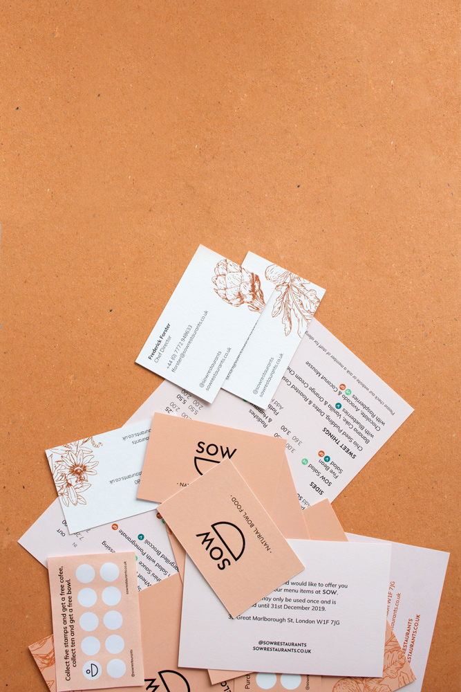
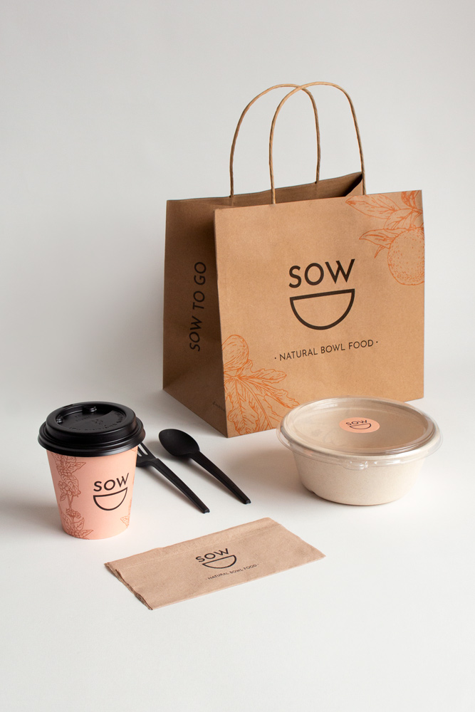
Acting as ‘brand guardian’ we were involved in the design of the logo, colour palette, packaging, illustrations and signage, and also helped to oversee the development of the website, photography and copywriting ensuring consistency across all forms of communication.
Drawing from references of ceramic and clay, the colour palette features rich terracotta tones, softer nude hues and accents of black, which bring elegance and sophistication to the branding.
The logo evolved from a series of playful hand-drawn studies, which took cues from the circular forms present in traditional pottery. The purity and harmony of these shapes suggest values of integrity and wholeness, key to the brand’s philosophy.
Branding elements subtly intertwine with the interior with hand-painted illustrations and considered graphics punctuating the space. The presence of bespoke mirrors and curated lighting create an atmospheric play of light and shadow that brings out the textures in each surface.
Tags: Commercial
“The team at Freehaus have been instrumental in giving a voice and look to our vision.
They worked with us to establish the efficiency of our operational model and the viability of many prospective sites that we have been considering.”
Peter Farrell, Founder, SOW
Logo Variations
Material Palette
Coming soon.


